Branding
NMU Logos
This section explains the correct treatment and usage of the Nelson Mandela University logo

Logo Versions
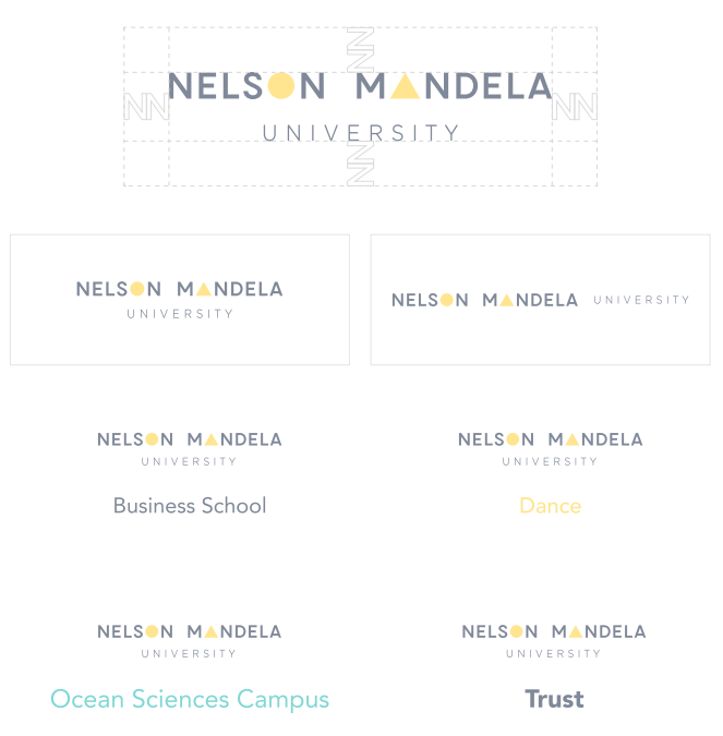
Full Colour Version
This example shows the correct usage of the full colour primary version of the Nelson Mandela University logo. Please use the full colour version whenever possible.
One Colour & Reversed Version
This example shows the correct usage of the one colour version of the Nelson Mandela University logo. This version should only be used when the application doesn’t allow for the full colour version.
Secondary Logo
This example shows the correct usage of the secondary version of the Nelson Mandela University logo. Please use the primary version whenever possible.
Logo Clear Spacing
Use the height of the letter ‘N’ multiplied twice on its back from the logo to create a frame of free space around the logo. Follow instruction for all applications.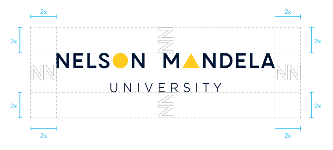
Logo Minimum Sizing
Below are examples of the minimum size logo for all applications. The stacked and linear versions of the logo may not be used any smaller than the provided dimensions.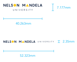
Use of the Logo
Usage
Examples illustrating the correct use and incorrect use of the Nelson Mandela University logo. The Nelson Mandela University brand is to be used as shown below without exception.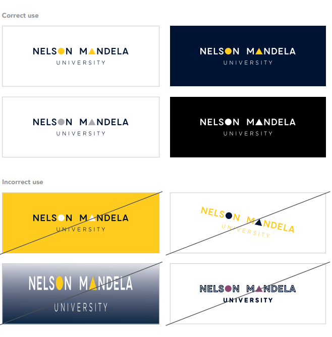
Logo Colour Variations
Below are examples of the Nelson Mandela University logo in standard and reversed out colour
Sub-brand Logo
This example shows the correct usage of the full colour sub-brand of the Nelson Mandela University logo. Please use the
full colour version whenever possible. The font weight applied to ‘Business School’ is to be set on Avenir Roman at all
times.


Society Name Logo
This example shows the correct usage of the full colour scociety name of the Nelson Mandela University logo. Please
use the full colour version whenever possible. The society name logo should always be applied with the Pantone 7548 C
brand colour. The font weight applied to the society name (i.e. ‘Dance’) is to be set on Avenir Roman at all times.


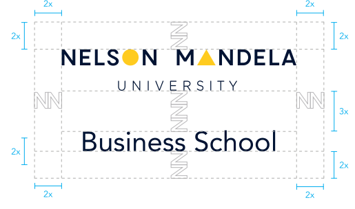
Sub-brand Logo Clear Spacing
Use the height of the letter ‘N’ multiplied twice on its back from the logo to create a frame of free space around the
logo. Follow instruction for all applications. The font weight applied to ‘Business School’ is to be set on Avenir Roman at
all times.

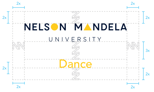
Society Name Logo Clear Spacing
Use the height of the letter ‘N’ multiplied twice on its back from the logo to create a frame of free space around the logo.
Follow instruction for all applications.

Co-brand
Co-brand Logo
This example shows the correct usage of the full colour co-brand of the Nelson Mandela University logo. Please use the full colour version whenever possible. The Ocean Sciences Campus logo should always be applied with the Pantone 326 C brand colour. The font weight applied to ‘Ocean Sciences Campus’ is to be set on Avenir Roman at all times.
Co-brand
Co-brand Logo Clear Spacing
Use the height of the letter ‘N’ multiplied twice on its back from the logo to create a frame of free space around the logo. Follow instruction for all applications.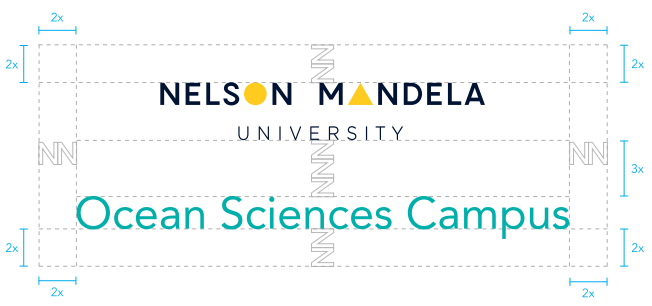
Sub-brand / Society Name / Co-brand Logos Reversed Out Colour Variations
Below are examples of the sub-brand, society name, co-brand logos reversed out.


University Trust Logo
This example shows the correct usage of the full colour Nelson Mandela University Trust logo. Please use the full colour
version whenever possible. The font weight applied to ‘Trust’ is to be set on Avenir Black at all times.


University Trust Logo Clear Spacing
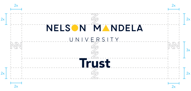
Use the height of the letter ‘N’ multiplied twice on its back from the logo to create a frame of free space around the logo.
Follow instruction for all applications.
